Windows 10: Anniversary update – What’s new? (Part 2)
We have already had a brief review of Windows 10 changes introduced with Anniversary update, released in the beginning of August. Now, after we had some time to play with it, we can take a closer look at what had been changed in Windows 10.
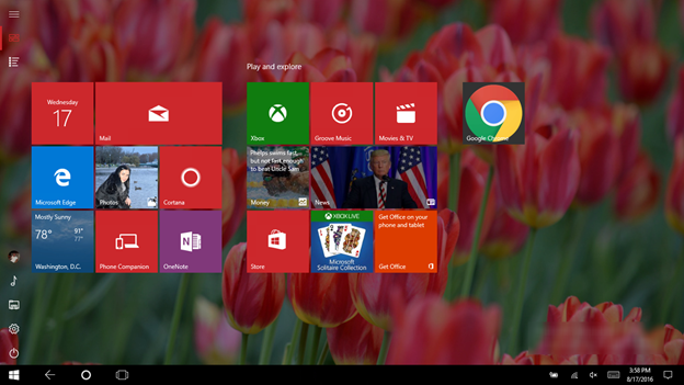
The first thing we noticed last time was the change of Start menu design, however we didn’t try to switch to the tablet mode, which was also redesigned.
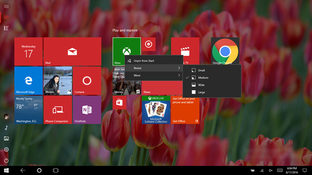
By default, Start menu shows not all the programs and apps available, but the pinned ones, although you can switch to All Apps, by clicking the corresponding button in left upper corner. Also, you can resize the tiles by clicking the right mouse button to make them fit to your screen. With Metro UIintroduction in Windows 8, I couldn’t really understand why some tiles are long, some are small and how to change their shape. Now you can manage tiles one by one depending on how often you use them and need them.

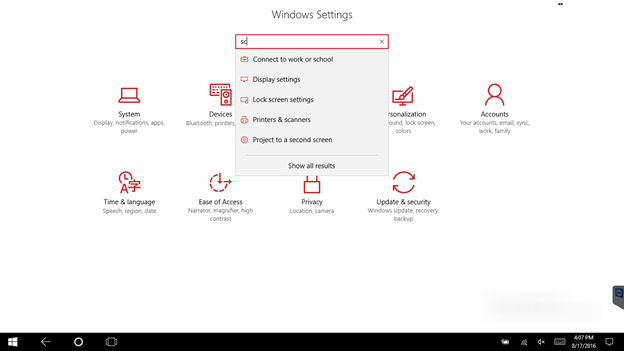
If you switch to Windows Settings screen, you will notice another minor change – the Search field was moved to the center of the screen. In addition, once you start typing the setting or a screen name, Windows will show you the possible variants.
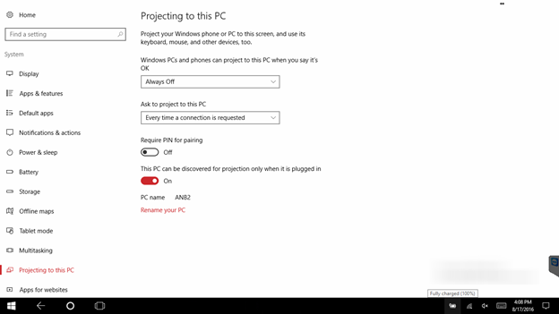
The settings list has also been changed, for example you can find the new option – Projecting to this PC, which allows to project pictures to your PC from Windows Phone or another Windows computer.
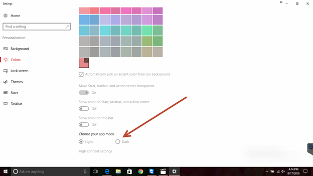
Personalization screen has also undergone some changes, now you can switch from light to dark theme with one click. The feature is especially useful for people who work with one and the same computer during days and nights.
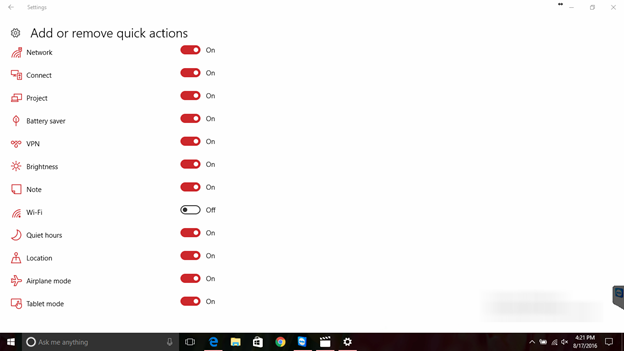
Another useful option is managing the list of quick actions screen, now you can add or remove settings that you need or don’t need. For example, why would you need an Airplay mode icon or location icon on your home computer.
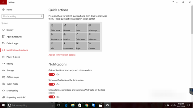
Also, you can manage Notifications that will pop up in your Action Centre, which, by the way, became more informative.
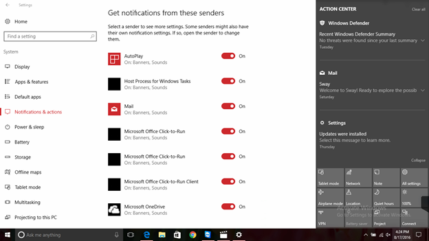
As you can see, the majority of introduced changes seem to be minor, but they make Windows 10more user friendly and more convenient. For example Windows Ink ( that we couldn’t really play with as our laptops don’t have touchscreen) – a special desktop space that you can use for making notes with our stylus. It can be called immediately from the action centre. You can read more about Windows Ink in our other article Apparently, Microsoft is trying to put all the necessary settings to the most convenient places, so we wouldn’t need to browse multiple screens searching for the necessary options.
This year we expect another major upgrade for Windows 10, although it’s doubtful that the update will bring some drastic changes. More likely we will have another set of small design compromises to make Windows 10 even more useful for both – touchscreen and keyboard\mouse users.
We will continue to search for the new features in Windows 10 and hope you find this article useful.
- On August 17, 2016
- 0 Comment

